“Here’s the thing: I don’t hate my job. I don’t necessarily love it, either. It’s interesting and fast-paced and I like working with a team. I also like the consistent salary and the security that comes with it...But sometimes I get the urge to quit and start over. I get antsy and want to leave. Then I think about it and wonder why. Will I regret not trying something else?”
Read MoreIllustrations by Michelle Mattar
Mission Uncomfortable: Embracing the Breakups & Breakthroughs of Creativity
I wasn't following up on my own work – which is awkward to say, but I don't think the majority of people in this industry do. My old style was to hand it off and hope for the best, largely because the deliverables were designed for that. Lately, I don’t hand off and hope.
Read MoreDear Burnt Out Art Director...
Remember how hard you worked because of how excited you were? You are more than capable of channeling that same excitement, ambition and dedication towards shifting the tides of your career towards something better suited for you.
Read MoreThe World is Getting Darker. This Facebook Art Director Adds Delight to the Corner She Controls
No matter how dark things seem to get, WNW Member Tori McGoogan is always trying to balance it with some positivity. And as a full-time art director at Facebook, Tori’s in a position to bring that positivity to the lives of a lot of people. It’s one she doesn’t take lightly.
Read MoreIllustration by WNW Member James Clapham
401 (Yay!) How to Save Your Creative Future
The days of company pensions are long gone and we’re staying alive longer than ever. There is no doubt that we need to save aggressively for our retirement so we can afford to live when we can no longer work.
Read MoreWhat It Takes to Work at Work & Co: Meet Co-Founder Joe Stewart
Work & Co's Founder and Design Partner Joe Stewart tells us how Work & Co was born from wanting to get his design hands dirty again, and the internal trust that exists with having agency leadership learning and building alongside you. Joe also offers great advice on what it takes to work there, as well as what he looks for in prospective hires and their creative portfolios.
Read MoreThe Top Companies WNW Creatives Would Kill to Work for Full-Time 2017
We surveyed our members for the fourth year in a row, asking them which companies they’d kill to work for full-time.
Read MoreHow to Get a Job at Spotify
Spotify! I've been looking forward to this interview and I’m happy to finally share it with you. As some of you may already know, I worked at Spotify for almost three years. So I couldn’t resist reaching out to my friends and asking for their wisdom about landing a design job at Spotify.
Read MorePROFILES OF THE WEEK: JANUARY 9TH
PROFILES OF THE WEEK: JANUARY 9TH
Frank Ockenfels, Photographer. Los Angeles.
Maggi Machado, Copywriter. London.
Rizon Parein, Designer. Antwerp.
Giulia Zoavo, Illustrator. Milan.
Vittorio Perotti, Art Director. New York.
Duke Aber, Designer. Weston.
Audrey Desler, Portland. Designer.
Rua Perston, Art Director. New York.
Are you a WNW Member with new work, exhibits, products, or news to share? Email us!
MEET CHUCK KERR, ART DIRECTOR AT VARIETY
MEET CHUCK KERR, ART DIRECTOR AT VARIETY
Sometimes the best way to equip yourself with the tools to succeed in your field is to just jump in head first and learn on the go. That's how WNW Member Chuck Kerr got his start as a magazine art director in his hometown of San Antonio: "I was a 22-year-old, one-man art department with almost no freelance budget to work with and a weekly magazine to put out. To create 52 original covers a year, I had to experiment, improvise, and stretch my creativity every single week. Best education I ever received, hands down."
Chuck tells us how he winded up as Art Director at Variety, a perfect fit for his diverse skills, one of which is working with constant, tight deadlines. Chuck also offers a glimpse into his creative process: "I feel like once you crack the core idea of what the story is trying to say, every other design decision becomes easier — the concept tells you what to do. When something ultimately clicks for me, hopefully this means it will click for the reader, as well."
As a creative and hirer, Chuck shares some great advice for creatives looking to work at Variety. "If you want to get into the weekly magazine world, you’ll have to be flexible and fast. As much as I may want extra time to do tons of research, make mood boards, take nap breaks, and workshop something until it’s perfect, the deadlines never stop coming. Having confidence in your abilities and knowing to trust your gut are valuable skills when turnaround can be so quick."
Tell us a little bit about your creative background. Who is Chuck Kerr and how did he get here?
I grew up in San Antonio, Texas and was always really into drawing, comic books, and music. When it became clear that being the next great Marvel artist or a famous drummer wasn’t going to work out, I gravitated toward writing and designing for my high school and college newspapers. As an undergrad, I interned at my hometown alt-weekly, the San Antonio Current, before becoming their full-time art director in 2006. I was a 22-year-old, one-man art department with almost no freelance budget to work with and a weekly magazine to put out. To create 52 original covers a year, I had to experiment, improvise, and stretch my creativity every single week. Best education I ever received, hands down.
After six years at the Current, I was more than ready for new challenges, so in 2013 I moved to Seattle to launch some new Pacific Northwest travel magazines for Sagacity Media. While I loved living and working in the PNW, an out-of-the-blue offer from Variety was too good to pass up, so I moved to Los Angeles in 2014 and am back in the world of weekly magazine deadlines, only now on a much, much larger scale.
How would you describe your creative style? Do you recognize a signature style that links all of your projects, or do you try to excuse yourself and approach each project as its own entity?
With every project I work on, whether it’s editorial design, logo design, comics, or whatever, I am always looking to get a gut-level, emotional response from the reader. The reaction I’m aiming for is always somewhere between “Wow!” and “Oh, of course” — the sweet spot where something is simultaneously a total surprise but also satisfyingly obvious.
One of my favorite parts of the job is coming up with visual concepts for complex or thematically rich stories. I feel like once you crack the core idea of what the story is trying to say, every other design decision becomes easier — the concept tells you what to do. When something ultimately clicks for me, hopefully this means it will click for the reader, as well.
In general, my personal style tends to lean toward bold, graphic ideas, without too much extra ornamentation. Sometimes it’s a matter of putting too much stuff on a page and then editing it down, removing elements until what’s left is absolutely essential. That being said, I do have a pretty healthy sense of humor, and enjoy slipping in small details when they add something without distracting from the overall package. For example, I recently did some freelance work for Seattle Met magazine, designing a fun feature story about Sasquatch hunters. On the very last page of the section, I replaced the page number in the folio with a tiny silhouette of Sasquatch — so after several pages dedicated to how elusive this creature is, readers get a little Sasquatch sighting of their own. That was a fun one.
I am always looking to get a gut-level, emotional response from the reader. The reaction I’m aiming for is always somewhere between “Wow!” and “Oh, of course” — the sweet spot where something is simultaneously a total surprise but also satisfyingly obvious.
You’ve been an Art Director at Variety for more than two years. What separates Variety for you? How have you seen its identity evolve from within in recent years?
Variety is a legendary brand that has covered the entertainment business for over 110 years. Our readership is primarily people in the industry, so we focus on news and analysis rather than celebrity gossip. While its core mission has remained constant since its early days, Variety has survived turbulence in the print industry by changing with the times, evolving from a daily broadsheet, to a weekly newspaper, to its current form: a perfect-bound, oversized magazine, which launched in 2013.
Back when I was interviewing, creative director Chris Mihal sent PDFs of back issues for me to check out, but I was truly blown away when I got physical copies in the mail and saw how much care and attention went into each issue. Between our high production value and routinely working with the best photographers and illustrators, the Variety art team is committed to making the print edition as beautiful as it is informative.
Variety is a legendary brand that has covered the entertainment business for over 110 years. Our readership is primarily people in the industry, so we focus on news and analysis rather than celebrity gossip.
Which of your projects for Variety are you proudest of and why?
I’m proud to be designing for Variety each and every week, but there are a few projects where I felt like I brought something unique to the table.
Not long after I started, Variety had a cover story about the so-called “Morning Show War” between NBC’s “Today” and ABC’s “Good Morning America.” We obviously couldn’t photograph the anchors, so we had to go conceptual for the cover. I came up with the idea of having two coffee mugs — one with the “Today” logo, one with “GMA’s” logo — smashing into each other like “Monday Night Football” helmets, hot coffee erupting everywhere. Then when you opened up to the feature spread, both mugs were cracked, standing in puddles of coffee with steam rising up like on a battlefield (I think I even namedropped “Saving Private Ryan” during the original pitch). Craig Cutler and his team in New York shot everything practically and captured the carnage beautifully. People always assume it was created digitally, but nope — real coffee, real mugs.
This year, Variety did an issue devoted to “Hollywood and Politics.” For one of the feature story illustrations, I proposed that we pay homage to the famous Richard Nixon Esquire cover by George Lois — only instead of Nixon getting ready for his close-up, it’s Donald Trump. Illustrator Anita Kunz did such a great job that we all had to agree it should be promoted to the cover. Even though it’s got one of my least favorite people on it, it’s still one of my favorite covers.
Another cover I’m proud of is much more recent: our 2016 “Global Issue,” which looks at how the entertainment industry is doing across the world. Instead of doing a traditional illustration, I had the idea to model the entire cover on a U.S. passport, complete with gold foil lettering and a custom seal which was designed by La Tigre in Italy. I always love when print publications take advantage of the fact that they have a physical form, and I especially love the idea of a film executive with a huge Variety-size passport on their desk. And who can resist gold foil?
I’ll listen to music related to the story I’m working on as a way of getting “in tune” with it. For instance, a recent cover story on “La La Land” had me listening to Chet Baker and the Bill Evans Trio, and a feature on Paul Thomas Anderson’s “Inherent Vice” was mostly designed while listening to Can and other psychedelic ’60s groups.
What’s your general process for designing Variety features? Do you research the individual and project, or work entirely from the text?
For me, it starts and ends with the story. We cover everything from media mega-mergers to Oscar season, to filmmaker and actor profiles, and everything in between. Each feature layout has to reflect the subject and tone, but also fit in with our overall aesthetic. Ideally, I’ll have the story in hand to read before designing, but sometimes time constraints mean writing and designing happens more or less simultaneously. Any original photography or illustrations will obviously have a big impact on what the pages look and feel like, but when time permits I also try to do my own research into the subject in case it triggers any design ideas.
My officemates know I tend to wear earbuds pretty much all day, but what they might not know (nerd alert) is that occasionally I’ll listen to music related to the story I’m working on as a way of getting “in tune” with it. For instance, a recent cover story on La La Land had me listening to Chet Baker and the Bill Evans Trio, and a feature on Paul Thomas Anderson’s Inherent Vice was mostly designed while listening to Can and other psychedelic ’60s groups. I don’t do it all the time, and I have no idea if this makes a huge difference to the final product. But it’s fun to think that it does, even if only in the smallest way.
Who and what are your biggest creative influences?
There is so much inspiring stuff in the magazine world right now. I’ve been a longtime fan of GQ and Wired, and most recently have gotten into Condé Nast Traveler since Caleb Bennett took it over. Mike Solita’s newly redesigned Fortune looks amazing and is currently being passed around the office, and we also regularly share copies of Leo Jung’s always-great California Sunday Magazine. T.J. Tucker and his team are still putting Texas Monthly into a league of its own when it comes to city/regional magazines. I love what WNW Member Claudia de Almeida does at o Banquinho, especially her stunning type treatments and her work for San Francisco Magazine. Benjamin Purvis’s redesign on Runner’s World made that book a must-read; their front of book section is really inventive and cool. I loved what Chris Skiles was doing back when he was creative director at Houstonia, and Jane Sherman and Sara D’Eugenio do an amazing job designing Seattle Met every month. (Follow Sara’s Instagram dedicated to cool magazine design: @arteditdesign!) I think Tim Leong and company are doing incredible work at Entertainment Weekly. EW has a smart, fun energy and all the hidden Easter eggs consistently reward sharp-eyed readers.
Finally, an all-time favorite would have to be Richard Turley’s run on Bloomberg Businessweek, which was a master class in how to be innovative, authoritative, and clever. He really helped give that magazine a strong voice. BB comes up in the office on a regular basis.
I also still try to keep up with what alt-weeklies are up to, like The Stranger in Seattle. I might be biased, but I feel like alt-weeklies are great talent incubators and a lot of my favorite designers built up their chops at alt-weeklies.
I’m a big fan of the alternative comics work of Daniel Clowes, Adrian Tomine, Charles Burns, Jillian Tamaki, Eleanor Davis, Dash Shaw, and Chris Ware just to name a few. Many of these artists also moonlight as editorial illustrators, and are on my wish list to work with some day.
Speaking of comics … while not exactly a graphic design textbook, Scott McCloud’s Understanding Comics was a very, very early influence and detailed how ink on a two-dimensional page can create a three-dimensional, emotional response in a reader. I feel like every designer (and editor!) should read this book, it has a lot of great things to say about the relationship between words and pictures, and what is a magazine if not a bunch of words and pictures?
Having confidence in your abilities and knowing to trust your gut are valuable skills when turnaround can be so quick. One thing that makes it all easier: The Variety art team is a great creative group that genuinely enjoys working together.
What advice can you offer to creatives hoping to work at Variety? What can they expect from Variety’s creative culture and what would it take for them to succeed there?
If you want to get into the weekly magazine world, you’ll have to be flexible and fast. As much as I may want extra time to do tons of research, make mood boards, take nap breaks, and workshop something until it’s perfect, the deadlines never stop coming. Having confidence in your abilities and knowing to trust your gut are valuable skills when turnaround can be so quick. One thing that makes it all easier: The Variety art team is a great creative group that genuinely enjoys working together. I feel very lucky to work with collaborators who actually know how to collaborate. We all strongly believe in putting the work first and egos second, and letting the best idea win, because — hey, guess what? Then everybody wins.
What do you look for in a creative portfolio that is unique to Variety? Any tips for creatives to breathe life into their portfolios?
“Be undeniably good.” That was Steve Martin’s advice on how to succeed in comedy, and I think it applies to pretty much everything. The Variety art team sees tons of portfolio websites and we look at tons of magazines, and the artists that stand out the most have strong, unique voices and distinctive styles. We tend to go after people who are very consistent because we always want to have a pretty good idea what the final piece will look like before we hire them. If you’re someone who dabbles in several different aesthetics, it might be a good idea to focus on just one or two styles so art directors know more or less what to expect when they reach out to you. We usually don’t have time to go back and forth with an illustrator for several rounds of revisions, and if that did happen, we would probably avoid that person forever.
A couple other things: Check out what kind of work gets published in your favorite publications or websites, and if you fit in with what they already seem to like, feel free to submit your work to them. Blind submissions (“Hello sir and/or madam…”) tend to be less successful. Also, if you’re still building up your portfolio, personal work or fan art can be fine — especially if it has a really unique point of view — but we mostly want to see if you can tell a story visually. So one thing you could try is taking a pre-existing story and creating your own illustration for it. Even though it’s unpublished work (and make sure to label it as such), it will demonstrate that you can create art in service of a specific story, which is what you will be doing 99% of the time when illustrating for editorial. Bottom line: Make the kind of work you want to be hired for, and if you’re persistent and consistently good, you’ll break through.
What’s next for you?
We are going to head into a short publishing break while we gear up for early 2017 — specifically Oscar season. I’m hoping I’ll do better on the office Oscar pool this year; last year’s was rough. (How could Stallone not win for his work in Creed? How?!)
What do you do when Not Working?
“Not Working” isn’t something I do very often, even when I’m not at work. In 2014, I founded a monthly collaborative zine night at Meltdown Comics in Hollywood, based on a similar event I used to attend in Seattle. Melt-thology is an inclusive, social, creative space where artists of all skill levels get together and draw a one-page comic or illustration that I collect into a monthly zine for contributors. We average about 40-50 diverse artists per Melt-thology issue, and it’s been really inspiring to see the growing community that has sprung up around it.
The other thing I do, but have been taking an unintentionally extended break from, is play and write music. I’ve been playing drums since I was about 4 years old, and I also play the piano. I was pretty active in bands back in Texas and Seattle, and I’m hoping to go into the studio in early 2017 for my own songwriting project, Bad Breaks. Music is a big part of my life, whether I’m making it or watching it (or stuck in LA traffic, listening to it). My all-time favorite moment at Variety so far is meeting Brian Wilson at a cover shoot inside the studio where the Beach Boys recorded Pet Sounds in the mid-’60s. At one point, Wilson sat at a grand piano and plunked out some chords while photographer Marco Grob shot amazing portraits. It was like getting a very small, very special concert from one of the greatest musical geniuses ever, and that’ll stick with me for a very long time.
Who are some WNW Members whose work you admire and why?
I’ve been in LA for over two years now, but I admittedly still haven’t made many connections outside of the editorial world. One of the reasons I was so excited to join Working Not Working was to have a resource for getting to know other creatives in this city, and elsewhere. I do know a few WNW illustrators like Joel Kimmel, Erin Gallagher, and Daniel Fishel, who all do great work. Erin does amazing pop culture posters and illustrations, and we both had pieces in a recent Broad City-themed art show at Meltdown Comics. I look forward to meeting more artists and creatives through WNW!
Anything else you’d like to add?
Go Spurs Go.
Are you a WNW Member with new work, exhibits, products, or news to share? Email us!
PROFILES OF THE WEEK: DECEMBER 12TH
PROFILES OF THE WEEK:
DECEMBER 12TH
Kelly Beck-Byrnes, Copywriter. Los Angeles.
David Rothstadt, Editor. Brooklyn.
Meg Douglass, Art Director. New York.
Steven Preisman, Art Director. Toronto.
Sarah Jacoby, Illustrator. Philadelphia.
Colin Smight, Designer. Brooklyn.
Paul Janas, Art Director. Chicago.
Arley Cornell, Motion Designer. Oakland.
Are you a WNW Member with new work, exhibits, products, or news to share? Email us!
Photo by Matt Bauer
VICE'S DERSU RHODES WANTS YOU TO USE YOUR TALENT TO TAKE A STAND
VICE'S DERSU RHODES WANTS YOU TO USE YOUR TALENT TO TAKE A STAND
WNW Member Dersu Rhodes is a Venice-based creative and hirer on Working Not Working. In our interview below, Dersu offers generous insights into his process on both sides of the coin as Design Director at Vice. From creating verticals for Vice like its women's channel Broadly and lifestyle channel Viceland, to searching for creatives who are as passionate as he is about making original and meaningful work, Dersu both embodies and embraces the spirit of Vice. "Vice has said 'fuck you' to offshore drilling, pipelines, discrimination of all ethnicities and sexual orientation, and I full-heartedly stand behind that. I’m 100% ready to chain myself to some trees and hopefully VICE will let me use my PTO."
Dersu repeatedly stresses that every endeavor for Vice involves extensive collaboration among creative minds. And they're always on the lookout for more impassioned makers and thinkers. When we ask Dersu what advice he can offer to creatives interested in working at Vice, he cuts to the chase: "Email me if you want to work with us and also if you want to be involved in taking your talent and using it to take a stand against the dark shit that could possibly be coming."
Tell us a little bit about your creative background. Who is Dersu Rhodes and how did he get here?
I grew up in a family that celebrated and supported absolutely any crazy creative ideas that I had as long as it didn’t involve television or video games. I remember drawing for hours listening to Ladysmith Black Mambazo and acting out imaginary epic sagas in the woods behind our house. I still find myself coming across new artistic mediums and convincing myself that this is my next calling. The benefit is that I dive into a new way of telling stories which keeps it exciting; the issue is that I end up spending a lot of time doing some stuff that doesn’t make a ton of sense for my career. For example, freestyle rapping.
My core has always been Fine Art, as that is what I went to school for. That eventually translated into graphic design, art direction, and more recently directing live action and motion graphic pieces. I come from 6 years in the surf industry before I got into advertising and media, so a lot of my aesthetic originates from that world. I also ran away to Berlin a few years ago, so my taste for sun flares was replaced with darker, moodier work.
How did spending your formative years in such naturally beautiful places as Montana and British Columbia inspire and influence your creative pursuits into film and design?
It’s funny that when I was growing up I couldn’t wait to get out of the wilderness. I thought that photo shoots and films that took place in the city felt more real and were more interesting. Now, I keep writing stories or dreaming up shoots that take place in the places I grew up.
I didn’t realize how much that chapter of my life and part of the world would influence my work until recently. I find myself gravitating towards stories that involve the outdoors or spreading a message of conservation and staying connected to nature. Now more than ever, my fear is the places that have been the source of the most peace and happiness will not always be here. Anytime that I’m feeling frustrated or uninspired I go surf, or go into the woods and immediately my brain takes a breath and I notice creative thoughts creeping back in.
How would you describe your creative style? Do you recognize a signature style that links all of your projects, or do you try to excuse yourself and approach each project as its own entity?
It varies a bit according to the project or client but my own personal style is really reflected in my Instagram feed as of late. I’ve really tried to collect inspiration and projects that I feel reflect my current mood and style.
I love photography and art that really makes me feel something. Vice has definitely influenced my taste and I find myself working with photographers who tell stories that are very authentic and gritty. On the other end of the spectrum, I love working with my friend Dean Bradshaw who has a more polished look, but his ability to tell stories with his work is just as impactful.
I’ve always loved Scandinavian design and the book Dutch Graphic Design sat on my desk for a long time. The ability to direct the eye with so few elements is mesmerizing to me and I try to mirror that effect in a lot of my work.
I recently had a friend suggest an exercise that could help define my signature style. He told me to pull together 100 images that speak to me and create a mood board with them, I’ve done this over the years and I realize that the style I’m drawn to has really changed a lot. It seems minimalism and emotion have really started to play a part in my work.
As a co-founder of music/style blog “Witness This” and a deep house DJ, what does the art of curation mean to you?
Curation is everything at this stage of my life. There is rarely a project that doesn’t involve more than one medium, and most projects present the opportunity to involve illustration, dance, photography, or music. Witness This began as an excuse to interview the people in my life who inspired me. In time it became a reason to reach out to artists or photographers in different cities and presented opportunities to learn from them. I approach most of my interviews with people like photographer Damien Vignaux or DJ HOJ as not only a chance to learn as much from them as possible but to try to convince them to collaborate with us somehow. ;)
You’ve been Design Director at Vice for three years. What separates Vice for you? How have you seen its identity evolve from within in recent years?
Long before I got here, VICE was already flying. The people that are leading the charge are so passionate about the stories they are telling and so hell bent on succeeding that it was a dream just to be able to jump on board. It was an opportunity for me to learn absolutely everything I could and be a part of telling stories that truly matter. This company is ready to take a stand for all of the progress that has taken place over the last years. Vice has said "fuck you" to offshore drilling, pipelines, discrimination of all ethnicities and sexual orientation, and I full-heartedly stand behind that. I’m 100% ready to chain myself to some trees and hopefully VICE will let me use my PTO. My goal is to learn from all the incredibly talented and passionate people here from all media channels and continue to do everything I can to tell stories that truly matter and better the world.
Is it a challenge to adopt Vice’s distinctive voice when working on a project, or do you feel that you already spoke that language when you came in?
It can be challenging because we do have a lot of verticals (channels) at this stage. However, each vertical has a publisher who along with the channel manager and their squad truly become the voice and filter for that vertical. I helped launch the women’s channel Broadly and we clearly defined the brand guidelines for that vertical, while making sure it followed the overall Vice brand guidelines.
I come from the surf world and advertising, and in a lot of ways so does Vice. Jake Burghart, the most O.G. DP at Vice, comes from the surf/skate world and there are lots of people that have worked on both sides. Our in-house agency Virtue works on brand art and design so you have to be a chameleon.
What Vice projects, campaigns, or endeavors are you proudest of?
I am very proud of our work in helping to launch VICELAND. We cranked through the holidays working on the show packages for Huang’s World, Vice World of Sports and Party Legends which all involved a lot of talented designers, art directors, motion designers and producers working very hard and really caring about what we were doing. Every time I speak with someone and I mention VICELAND, people tell me how much they love it so that feels really awesome.
Working with Diplo and K-Swiss for the launch of “The Board” was amazing as well. We had a rock star team of creatives, producers, photographer and filmmaker's and the result was a campaign geared around educating young entrepreneurs in design, marketing and making a social impact. At one point we had 5 of us in a hotel room rewriting a creative script at 1 in the morning the night before our first shoot!
Being in a leadership position, how do you cater your approach to allow your left brain and right brain to coexist?
I listen to a lot of deep house and crush coffees in the afternoon. I try to keep my creative time where I can really dive into problems and strategy for early morning or later in the evening. During the day I find myself in meetings that sometimes involve numbers which are not exactly creative, or working on Keynote which is sometimes creative so it’s definitely not all fun and games. But we have a great team and we talk through a lot of our ideas which makes it fun during the day.
What advice can you offer to creatives hoping to work at Vice? What can they expect from Vice’s creative culture and what would it take for them to succeed there?
I can say that you should email me. We are looking for designers and motion people. If your work is good and you know what we do and want to join us then let’s do this. You can expect to work on the VICELAND broadcast network, on Noisey, Broadly, Thump, experiential events, brand work and any ideas you dream up that you want to pitch for any of the Vice channels.
What do you look for in creative portfolios that are unique to Vice?
Portfolios that have a point of view. Having good taste is really a huge part of it. That could look like curating a tumblr or having a section that showcases your favorite work. Showing that you are aware of what is going on in the design/art world is important as well. Also a lot of CV’s that I get are sadly designed and honestly I won’t even look at those. Try to present a tight package that reflects who you are and what you care about. Show me you have a personality and are passionate about doing good work!
What’s next for you? What are you working on now?
We’re working on a bunch of new network shows. I’m directing the main titles and branding/animation packages and also working on a few freelance passion projects. One project is directing a short doc about a guy in Oregon who finds animals that have recently been hit by cars on the side of the road, and makes incredible moccasins and bags while not wasting any of the meat. We’re on the hunt for a composer to score it at the moment.
What do you do when Not Working?
Finding music and DJing has been such a huge source of joy for me. I’ve kept the business out of DJing and as of now it’s the one creative avenue that has no rules. I can play what I want and no one is asking me to make the logo bigger, although we do occasionally get requests to play Rihanna. I also love surfing and spend at least a day a week in the ocean.
Who are some WNW Members whose work you admire and why?
Tony Chen (former VICE broadcast editor now freelance) is someone who I have loved working with over the years. He pours his whole heart into his work and is so incredibly passionate about learning and pushing the boundaries of storytelling. I also had the opportunity to work with Michael Sevilla. That dude is seriously one of the most incredible digital designers and artists in the world. Balind is a homie as well and such an intelligent creative director/strategist.
Anything else you’d like to add?
Email me if you want to work with us and also if you want to be involved in taking your talent and using it to take a stand against the dark shit that could possibly be coming. I’m ordering Jessica Walsh’s pins when I get home tonight. Viva La Revolution!!!
Are you a WNW Member with new work, exhibits, products, or news to share? Email us!
PROFILES OF THE WEEK: NOVEMBER 21ST
PROFILES OF THE WEEK:
NOVEMBER 21ST
Monica Welsh, Art Director. New York.
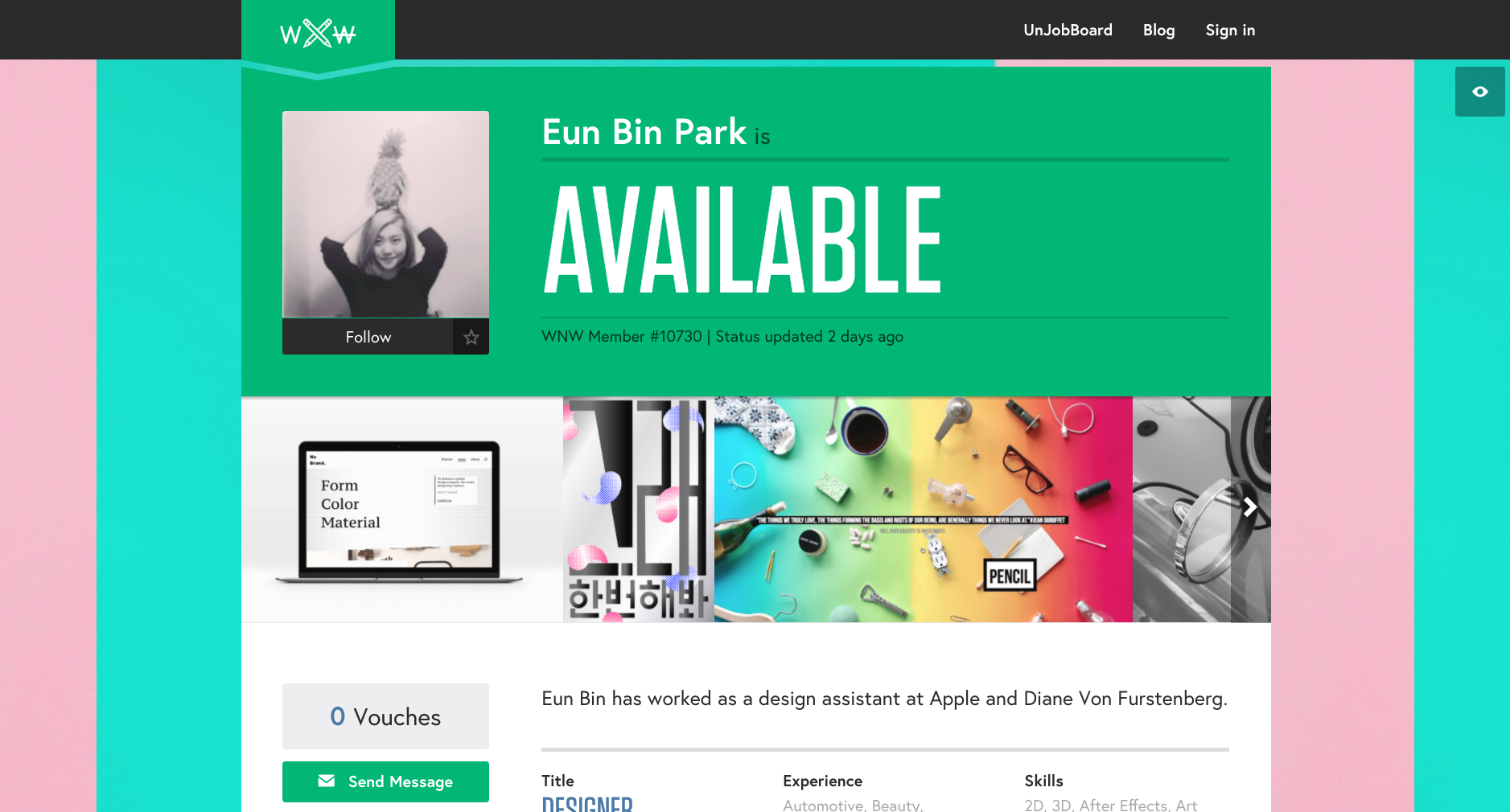
Eun Bin Park, Designer. Seoul.
Caitlin De Angelis, Producer. New York.
Michelle Hirschberg, Copywriter. Brooklyn.
Charles Haggas, Creative Technologist. Austin.
Miro Klasinc, Motion Designer. Los Angeles.
Corey Koberna, Art Director. San Francisco.
Are you a WNW Member with new work, exhibits, products, or news to share? Email us!
PROFILES OF THE WEEK: OCTOBER 31ST
PROFILES OF THE WEEK:
OCTOBER 31ST
Irene Kugelmann, Art Director. Berlin.
Josephin Ritschel, Illustrator. Berlin.
Andrew Teoh, Designer. Brooklyn.
Kris Seto, Copywriter. New York.
Lesley Scheuermann, Copywriter. Brooklyn.
Victor de Bone, Designer. Berlin.
Elena Miska, Designer. New York.
Victor Luo, Producer. Pasadena.
Are you a WNW Member with new work, exhibits, products, or news to share? Email us!
The Top Companies WNW Creatives Would Kill to Work for Full-Time 2016
The freelancing movement continues to climb, now making up 35% of the U.S. workforce. That rising desire for freedom and variety only offers a more powerful barometer to see which companies are adapting to the modern climate and offering enough goods to attract the best creatives.
Read MorePROFILES OF THE WEEK: OCTOBER 24TH
PROFILES OF THE WEEK:
OCTOBER 24TH
Jen Dodaro, Designer. Los Angeles.
Mekhi Baldwin, Designer. Oakland.
Samantha Siegel, Art Director. Los Angeles.
Chas Barton, UX/IA Designer. New York.
Jessica McGowan, Designer. Brooklyn.
Matthew Poitras, Copywriter. New York.
Kat Street, Art Director. Boulder.
Bill Spangler, Producer. San Francisco.
Are you a WNW Member with new work, exhibits, products, or news to share? Email us!
PROFILES OF THE WEEK: OCTOBER 17TH
PROFILES OF THE WEEK:
OCTOBER 17TH
Kat Kaye, Photographer. Los Angeles.
Björn Jonas, Photographer. New York.
Deanna Halsall, Illustrator. Manchester.
Haik Avanian, Designer. Brooklyn.
Katherine Fernandez, Copywriter. San Francisco.
Matthias Hoegg, Animator. London.
James Wignall, Director. London.
James Cameron Ewing, Art Director. San Francisco.
Are you a WNW Member with new work, exhibits, products, or news to share? Email us!
PROFILES OF THE WEEK: FEBRUARY 15TH
PROFILES OF THE WEEK:
FEBRUARY 15TH
Kali & Karina, Art Director. Los Angeles.
Amber Justis, Art Director. San Francisco.
Gabriel Pulecio, Creative Technologist. New York.
Lisa Kirchner, Art Director. Los Angeles.
Timothy Stroh, Designer. Loveland.
Jordan Fish, Director. Brooklyn.
Eric Wagliardo, Art Director. Brooklyn.
Mei-Ling Wong, Producer. Brooklyn.
Are you a WNW Member with new work, exhibits, products, or news to share? Email us!
Illustration by WNW Member #1612 Jing Wei
WNW MIXTAPE: SYNTH YOU'VE BEEN GONE
WNW MIXTAPE: SYNTH YOU'VE BEEN GONE
Here's a mixtape that's almost as much fun to say aloud as it is to listen to. Featuring perhaps one of the most overused yet still somehow under-appreciated instruments, Synth You've Been Gone finds WNW Member #5187 Nick Ceglia weeding through a dark world of bad synthesizer sounds and resurfacing with 14 gems. The party's capped off with "Sound and Vision" by the late David Bowie, who may be late but will always remain fashionable.
We also caught up with Nick to see what life is like as a full-timer on the creative team at Chipotle. Direct all "burrito buck" questions to him; we can't help you.
You can open the mixtape in Spotify here.
Tell us a little bit about your background. Who is Nick Ceglia and how did he get here?
I’m a photographer turned graphic designer turned copywriter, and I now write about burritos for a living. Been a curvy road to where I’m at, but I’m happy to have a background in a few areas.
What’s it like being part of the in-house creative team for Chipotle? Any tasty discounts?
It’s great—super fun to write for. We have a small creative team with very talented designers, and the company as a whole really values creativity and good design. And yes, plenty of tasty discounts. See me for some burrito bucks.
We’re big fans of your tumblr coverundercover. Did you discover a particular book cover undercover that lead you in search of other hidden gems? What was the most unexpected cover undercover you discovered? (Say that ten times fast and then answer it.)
The first cover I discovered was a French-English dictionary. I originally bought it for the jacket design and I didn’t find the design underneath it for a while. I think that was the most unexpected because they’re both great covers. It got me psyched and I started thinking about how many others I missed.
What % of the time do you listen to music while you work? Who are some of your favorite musicians/artists?
Quite a bit. My playlist is a good synth-themed mix of what I’m into. There’s some indie stuff, Talking Heads, Devo, and I got to fit in a Paul McCartney jam that’s pretty bizarre. Also looking forward to the impending Wolf Parade reunion.
What are you working on these days?
I’m currently working on what our packaging will be after our Cultivating Thought series comes to a close, which is pretty exciting.
What are some top tips you can offer creatives based on your area of expertise?
I think it’s good to try and not get bummed on small projects. Especially when you work in-house, you don’t always get sexy projects and a lot of it is working on the little aspects that make the brand what it is. If you can find a way to make a bathroom sign or some receipt tape funny, it can be pretty rewarding.
