Heather-Mariah Dixon on the Unique Creative Brief of Designing Death
Interview by Mike O'Donnell / Editor
WNW Member Heather-Mariah Dixon is a Brooklyn-based art director, designer, and principal of her eponymous practice, Studio HMVD. I recently spoke to Heather-Mariah about a rather unique creative brief: designing a book about death. When approached with the opportunity to design Some Light at the End, a book about hospice and end-of-life care, Heather-Mariah couldn’t resist the challenge to take on something new. Death itself is nothing new, but the transparency with which the author, a retired hospice nurse, spoke about the subject and its day-to-day preparation was. The practical implications from a design perspective were also strangely enlivening. Below, we discuss the ways in which design can communicate when words fall short, the creative challenges of bringing something approachable and earned to a subject as loaded yet ethereal as death, and the rewards of testing the edges of your creative process with a new format.
Tell me a bit about your creative background. How did you come to pursue a career in design?
After a childhood that fostered creativity, I found design in college while studying studio art & printmaking at Western Washington University in the northwest corner of Washington state. I was primarily screenprinting and producing lithographs, but kept making typographic compositions and zines, and eventually one of my professors recommended I check out the design program. After graduating with both degrees, I moved to New York City and dove headlong into freelance and full-time positions as a designer, focusing mostly on branding. Through my design work I fell into art direction and somewhat returned to the tactile nature of studio art, but now through a design lens.
Do you feel like there are consistent themes and through-lines in your work? What subjects most interest you as a designer?
I think my formative years in art school influenced me more than I’d like to admit— a lot of my design work has references to art, or falls a little in the gray area between the two. Though, like any other modern designer, I use digital tools day-to-day, a lot of physical process creep into my work— from making small-scale sets to using ink and paper to play with forms and ideate concepts.
I’m also a type fanatic and love having a very considered typographic system. In fact, it’s usually the starting point for a lot of my projects. I find that when you start with type you can bring voice and personality to your content, and the rest just falls into place.
Let’s talk about your latest project, designing Some Light at the End, a book about hospice and end-of-life care. What was the main reason you took on the project?
At the time when Beth Cavenaugh (the author and a 20-year career hospice nurse) approached me, I’d actually never designed a full book. I had done some chapbooks and editorial design, so the novelty and challenge of designing a book from cover to cover was exciting. I also loved the topic! I’m maybe a little morbid, but the author told me that there really weren’t books that spoke this transparently about death on the market, and that was so inspiring. A big goal in my studio practice (Studio HMVD) is to either create the new, or do the old in a new way— which means looking at the industry or space and understanding how I can reinvent it.
“Striking the balance between serious and approachable was definitely difficult. Some of my early iterations were very somber and a little cold. It was also hard to convey spirituality/metaphysical questions around death without making something that looked like it would be more at home in a crystal shop.”
What were some of the surprises and challenges that came with this undertaking?
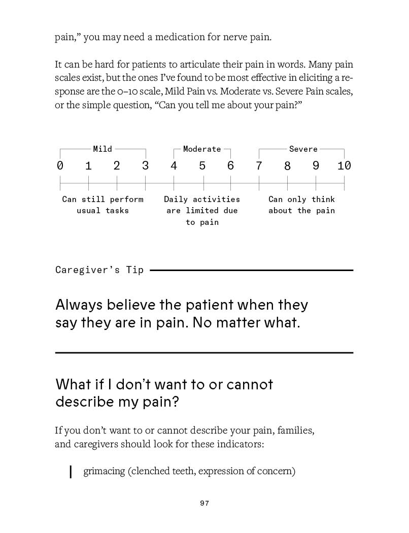
Striking the balance between serious and approachable was definitely difficult. Some of my early iterations were very somber and a little cold. It was also hard to convey spirituality/metaphysical questions around death without making something that looked like it would be more at home in a crystal shop. I had initially explored some dirty paint gradients, but they felt too edgy and raw. On the other hand, one direction featured friendlier typography and, paired with the client’s chosen illustrator, (Violet Reed) felt almost like it was making a joke of death.
Can you give some insight into your process and some of the design considerations that came into play with this project?
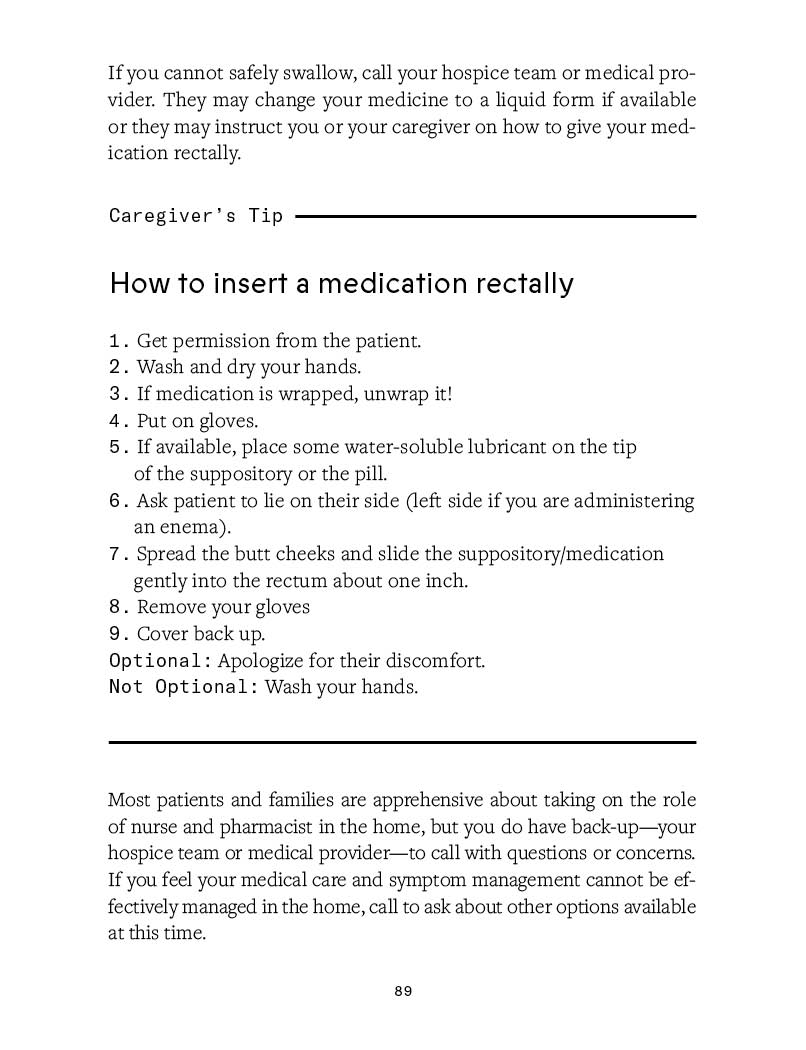
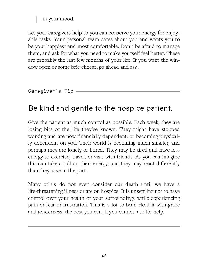
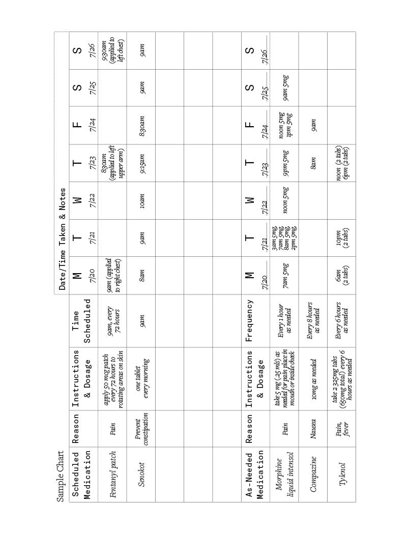
My first step for inspiration was to take a walk through some cemeteries and see how death and typography usually interact, over a long period of time. I noticed on a lot of tombstones there’s gaps and interesting justification between the dates. This helped me develop the typographic system that shifts from left to right aligned, though the typeface we ended up choosing is a much warmer version of a classic chiseled face. The consultancy that facilitated the project (Works Progress Agency) did a really thorough look at the competitive set, which also showed me the rest of the market and what recurring tropes I could avoid.
“My first step for inspiration was to take a walk through some cemeteries and see how death and typography usually interact, over a long period of time...though the typeface we ended up choosing is a much warmer version of a classic chiseled face.”
What’s it like trying to design something as loaded yet ethereal as death?
It’s a heavy responsibility, in some ways, but it’s also as natural as eating and sleeping and existing. Beth Cavenaugh’s writing did a really wonderful job of guiding you through the process of how to care for yourself or others at end-of-life. There was a brevity and soul to her storytelling and factual breakdowns that made it easy to translate. At the same time, I was working on this project alone in a concrete studio for nearly 9 months, over winter— it could be a little isolating, to say the least.
Looking back, what are you proudest of with this project?
I’m so happy with the spreads between chapters. Works Progress Agency wrote a series of prompts to ask your loved ones as they, or you, near the end of a life. Some were light and fun, some were about the minutiae of everyday life. For these spreads, I created custom artwork using decaying matter from the plants around the studio as my paintbrush. I made repetitive marks using ink, to symbolize how each life can be so different at the individual level, though overall we’re all bopping around on the same planet.
“The beauty of design is that it can present heavy topics and content in a way that’s digestible, and gives room for a person to pause and consider the subject more deeply. Compelling visual languages can convey emotions that aren’t as accessible through words, which can be a powerful tool for processing a matter and being, well, more open and okay with it.”
What role do you think design can play in opening up the conversation around death?
The beauty of design is that it can present heavy topics and content in a way that’s digestible, and gives room for a person to pause and consider the subject more deeply. Compelling visual languages can convey emotions that aren’t as accessible through words, which can be a powerful tool for processing a matter and being, well, more open and okay with it.
Any insights or lessons learned from this project that you can share with fellow designers?
If you specialize in a specific area of design or find yourself doing similar projects, take an opportunity to work in a different format. It really tested my creative process, perseverance, and diligence to undertake a project of this scale, but it was 100% worth it to hold a book in my hands at the end and know that I’d contributed to a meaningful thing.


